Works
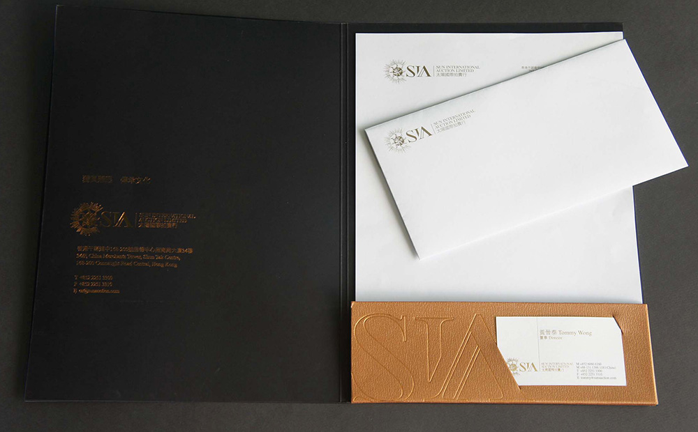
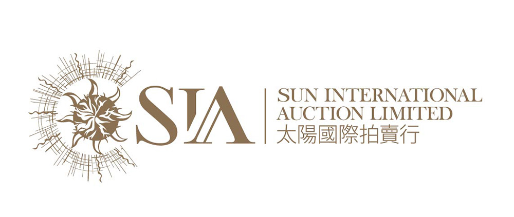
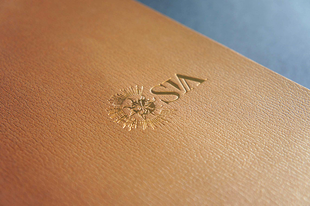
SUN INTERNATIONAL AUCTION
LOGO DESIGN
SUN INTERNATIONAL AUCTION
To emphaise SIA’s strong relation with art, the “A” in “SIA” is intended to mimic a corner of classic painting frame. The use of serif font is, on the other hand, to create a sense of gradeur.
「SIA」字樣中的「A」字採仿畫框的設計,以突顯拍賣行跟藝術品的連繫,同時用上serif字體,營造高雅感覺。