Works
平和ラーメン
平和ラーメン
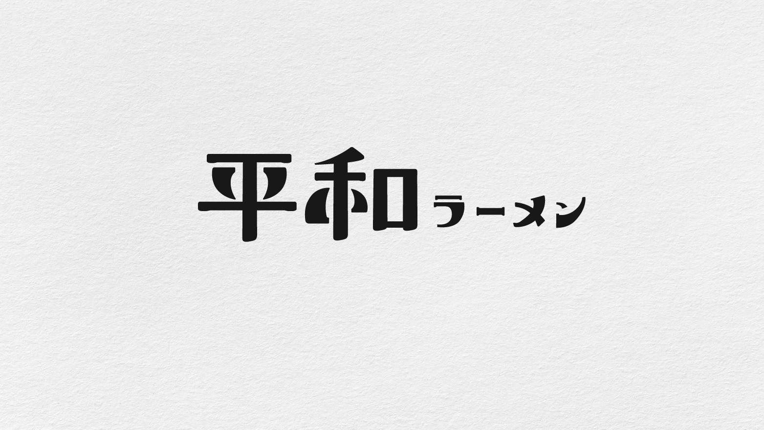
The logo is inspired by the style of Japanese character creation, featuring Song-style characters and powerful brush strokes, and designed as a computer font. The font avoids using right angles and instead uses rounded edges to create a friendly and approachable feeling. The stroke proportions are exaggerated to provide a lasting impression on the audience. The concept behind the artistic design is to enjoy a bowl of ramen in a peaceful manner, even in a chaotic environment.
LOGO參考了日本造字的風格,採用宋體字和強而有力的毛筆筆觸,去設計的電腦字體。字型避免使用直角,採用更加圓潤的方法帶出平易近人的感覺。當中的筆畫比例較為誇張,能夠提供深刻印象給觀眾。美術設計的概念是在煩雜、混亂的環境裏都可以平和地享受一碗拉麵。