Works
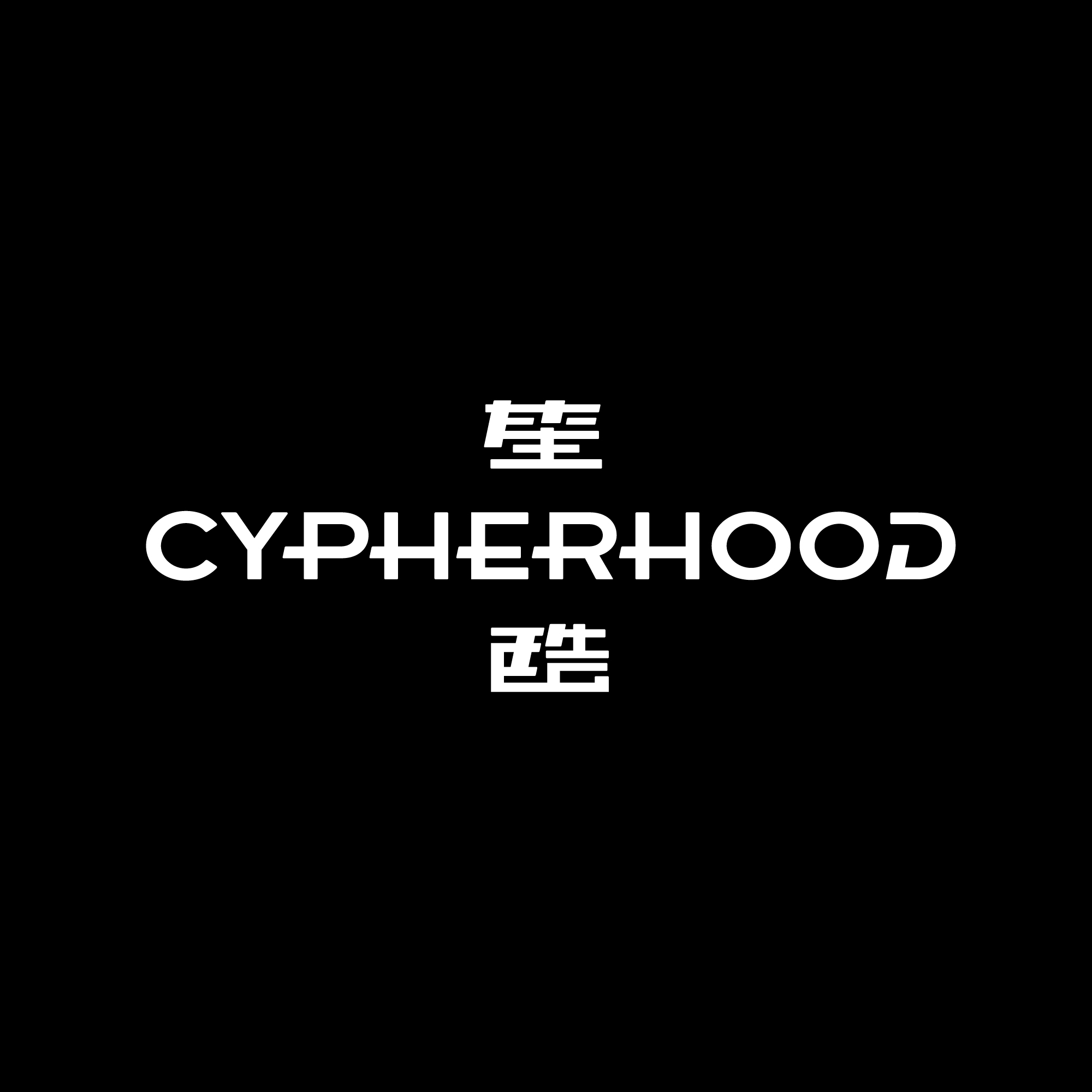
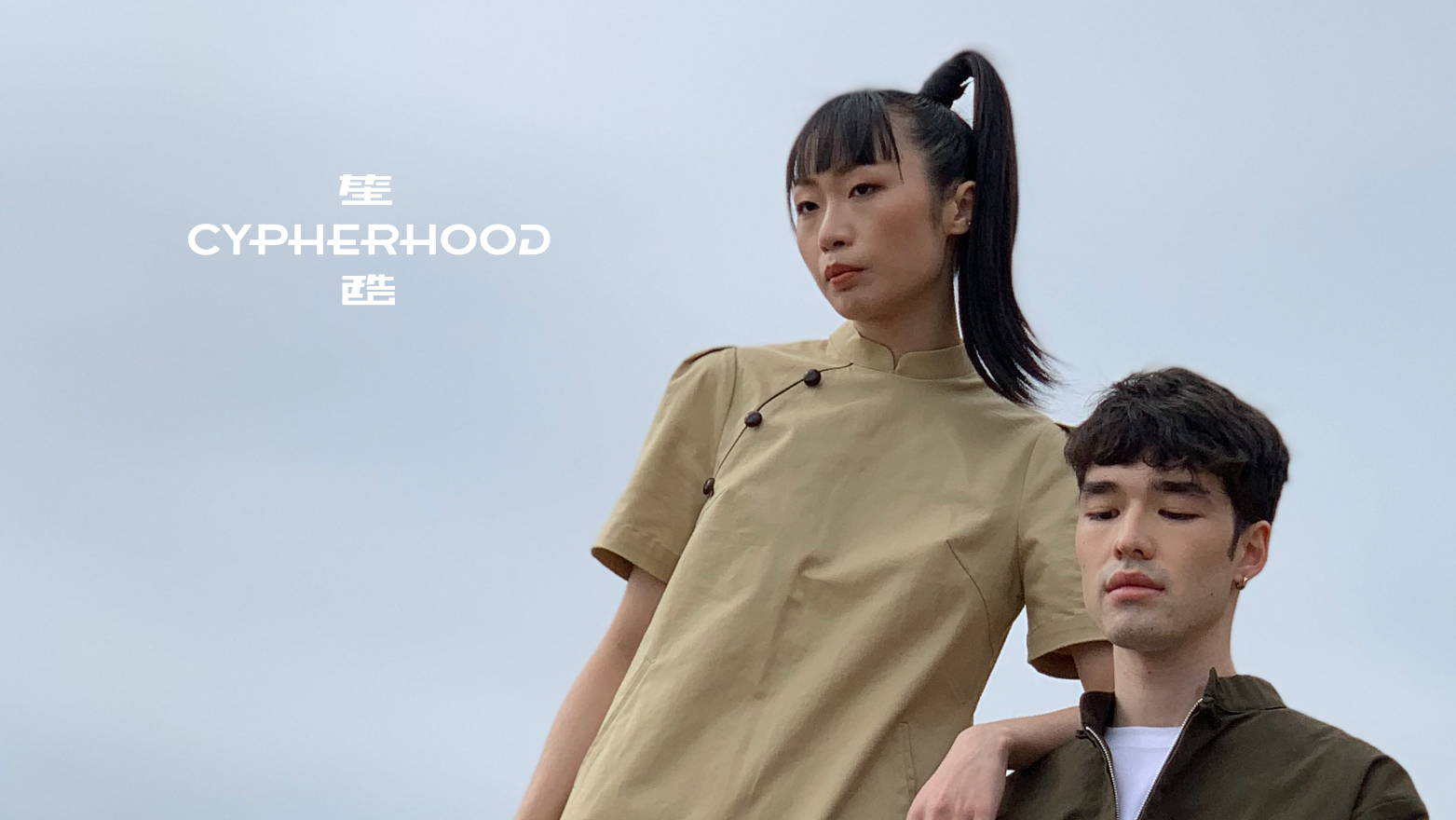
Cypherhood 笙酷
Cypherhood 笙酷
The inspiration for the logo comes from Hong Kong street signs and traditional Chinese attire. The vertical and horizontal layout commonly seen in Hong Kong street signs is deliberately imitated in the logo to create a sense of familiarity.
The font is borrowed from vintage posters, with clean and concise lines that give it a Hong Kong flavor, creating a youthful and energetic overall impression, while also emphasizing that the brand is a local one. The prominent horizontal line in the "CYPHERHOOD" logo represents the symmetrical front of traditional Chinese attire. Paired with a simple sans-serif font, it highlights the brand's fusion of Eastern and Western elements in its designs.
The font is borrowed from vintage posters, with clean and concise lines that give it a Hong Kong flavor, creating a youthful and energetic overall impression, while also emphasizing that the brand is a local one. The prominent horizontal line in the "CYPHERHOOD" logo represents the symmetrical front of traditional Chinese attire. Paired with a simple sans-serif font, it highlights the brand's fusion of Eastern and Western elements in its designs.
靈感源於香港路牌及唐裝。
上英下中及橫向是香港路牌常見的排法,logo 刻意模仿這種排法是為了增加親切感。而字體就借鑑了舊式海報,線條利落簡潔,具有香港 風味,使整體感覺年輕活力,同時也可以強調 品牌是本地品牌。
而標誌「CYPHERHOOD」突出來的橫線則代表 唐裝的對襟,再配上簡單的無襯線字體,註釋 了品牌的作品中西合壁。另外,品牌主色採用 紫色,帶來一點潮流味道及東方色彩。
路牌及直、橫線有引導的意思,意味著品牌為 大家「穿針引線」,引領傳統中華服飾與現代 服飾的結合,打造全新的潮流。
上英下中及橫向是香港路牌常見的排法,logo 刻意模仿這種排法是為了增加親切感。而字體就借鑑了舊式海報,線條利落簡潔,具有香港 風味,使整體感覺年輕活力,同時也可以強調 品牌是本地品牌。
而標誌「CYPHERHOOD」突出來的橫線則代表 唐裝的對襟,再配上簡單的無襯線字體,註釋 了品牌的作品中西合壁。另外,品牌主色採用 紫色,帶來一點潮流味道及東方色彩。
路牌及直、橫線有引導的意思,意味著品牌為 大家「穿針引線」,引領傳統中華服飾與現代 服飾的結合,打造全新的潮流。